Notes
The Barr Code: Why the Mueller Redactions Went Viral
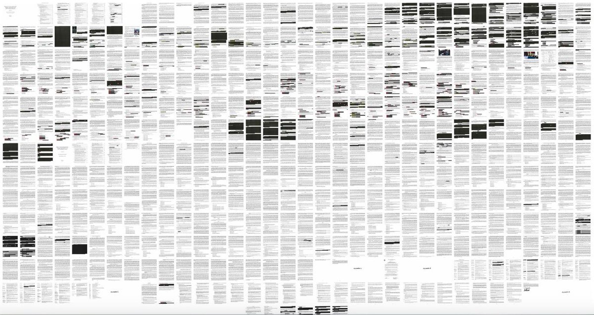
How fitting that, two years into Trump’s presidency and upon the final, but necessarily incomplete release of the Mueller Report, one of the most significant impressions of the document was pictographic. Usually reporting about a report involves careful verbal summary and synopsis, but in this case much of the pertinent language has been redacted. But thanks to John Schleuss and his scanner at the Los Angeles Times, we have a bird’s eye view on all the pages of the report put together—all 448 of them—to help us get a sense for just how much has been blotted out.
The image above went viral almost immediately likely because audiences were quick to assume in the black-and-white pattern that Trump-fronting Attorney General William Barr used his legal authorization to block key passages. The report may reveal “a pattern of deceit and dysfunction,” but this image circulated widely given the checkered fear that it’s a different pattern, a new cryptic code of political gamesmanship, that is being rendered here.
And the mark outs have another effect. Schleuss’s composite image helps us appreciate the extent to which Mueller’s report is filled with shady characters. It’s one more reason why we have seen so many pictorial references to Barr’s redactions.
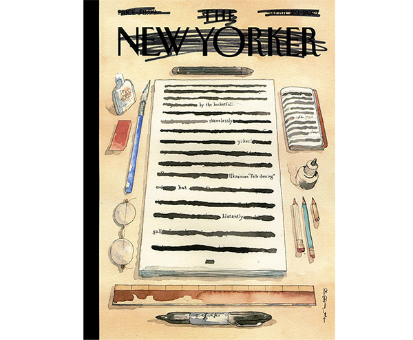
Take, for example, Barry Blitt’s illustration for this week’s cover of The New Yorker magazine. Not only does it draw out the pictorial nature of the word, it also reminds us that editorial splicing—apparently some of Attorney General William Barr’s favorite operations—cuts both ways: just as audiences are challenged to fill in the blanks where pieces of the text are missing, producing a text that looks this way also demands quite a bit of time, attention to detail, and creative effort.
So, in a case like this one, where the main story about the text turns on what happened to the text, we need pictures to convey why those who want to read the text are having a hard time doing so because they can’t see the text. By reducing the full Mueller report down to photographic scale, then, the composite thumbnail version of the text invites us to skip the reading part and judge the work by what’s covered.
Surely this is the context in which Jennifer Bendery at the Huffington Post can observe ironically that page 30 of the report only has been “lightly redacted” by AG Barr:
page 30 of Mueller’s report, lightly redacted by AG Barr pic.twitter.com/cVIsCGqSQQ
— Jennifer Bendery (@jbendery) April 18, 2019
It even seems like the black box, which is supposed to keep damning information under wraps, is now being repurposed as a key design element that helps journalists and reporters communicate the story about how Trump and his team handle themselves under investigation.
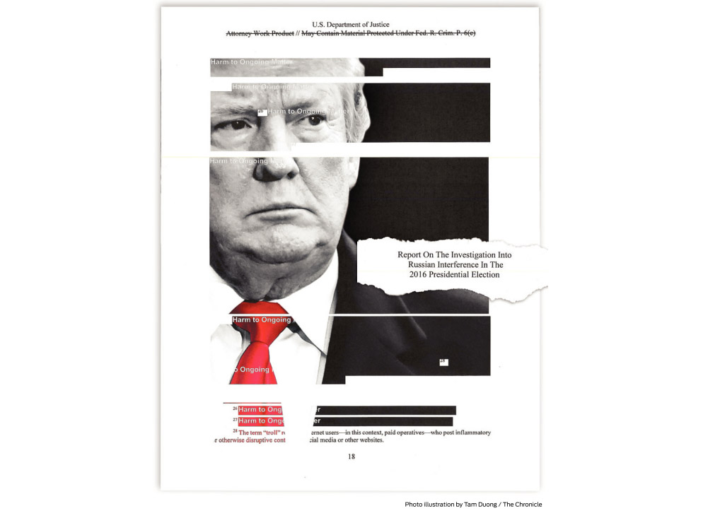
Tam Duong’s illustration for the front page of Friday’s San Francisco Chronicle, for instance, uses the black box motif to portray Trump as a glitchy figure who insists on unruly posturing in the face of a number of ongoing investigations:
Or consider an image by Gabriella Demczuk, whose photographs populate The New York Times’ digital storybook presentation of the Mueller investigation.
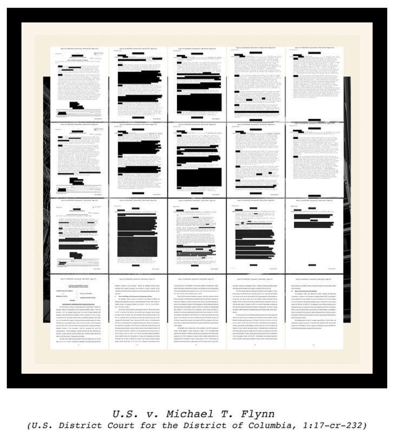
Demczuk’s picture of Michael Flynn’s legal documents speaks to a longer pattern of covering-up, for sure, but it also shows how photojournalism can turn to the framing conventions of fine art as a way to help audiences understand, in this case, that speaking truth to power is often provisional and dependent on special arrangements.
Pictures like this one indicate that we’re in a curious moment of information visualization. Media outlets appear to be taking maximum advantage of an increasingly visual, and visually savvy public to punctuate key takeaways, or even “data points,” in stories that accrue large amounts of information and unfold over long periods of time.
In fact, this intersection between photojournalism and big data visualization is not unlike what we encountered last week in astronomers’ first image of a black hole. Both the black hole image and the composite thumbnail image of the Mueller report are not photographs, but rather products of assembly that required extensive labor and long processes of digital reconstruction. Both make a point of what we can’t see, and they both remind us that forces beyond our control work in ways that constrain the release of illuminating material. And, in a special kind of narrative alignment, the black hole and black box images both record a limit case where the law seems to break down.
What we do know, then, is that the composite image of Mueller’s report is designed to visualize how much work is required to keep the President above the law. Problem is, ever since Adam and Eve used fig leaves to cover up their private parts, the censorial redaction has been recognized as one of the surest signs of guilt. Like the fig leaf announcing precisely where there is something to hide, the censor bar points our eyes straight to the most embarrassing sections of the body of text.
As we can observe in these visualizations by The New York Times, much of the ink that Barr spilt covers up passages detailing Russia’s effort to help get Donald Trump elected in 2016:
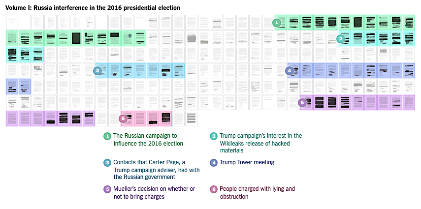
In this way the Barr code version of Mueller’s report confirms that Trump’s political style depends on an idiom of redaction. GPA? It’s a secret. Medical report? Can’t see it. Tax returns? Can’t see ‘em either. And now this. For a president who has always played fast and loose with words, what we see in the redacted Mueller report image is that it takes an entire communications infrastructure, including the Attorney General and his big black sharpie, to maintain the Orwellian routine of a man who has crafted his public persona around being able to say whatever he damn well wants to say, and then right in front of our eyes pull down the curtain and insist that it never happened.
— Philip Perdue
Image 1: Jon Schleuss/Los Angeles Times. Image 2: Barry Blitt/The New Yorker. Image 3: Tam Duong/The San Fransisco Chronicle. Image 4: Gabriella Demczuk/The New York Times. Image 5: Screen shot/K.K. Rebecca Lai, Derek Watkins and Karen Yourish/The New York Times


Reactions
Comments Powered by Disqus