Notes
ESPN's Body Issues


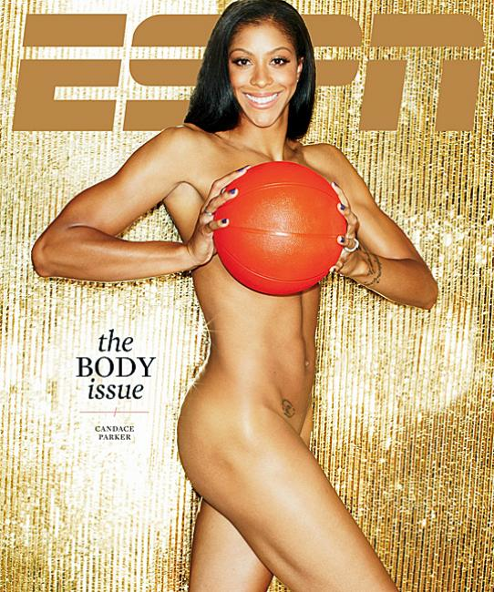
Looking at these ESPN covers (there are a total of six), an imaginative, if farfetched idea, might have been to try and represent the athleticism of these professionals, or to depict the intimate working relationship between the athlete and his or her soma, or to capture the intimate physical connection of the athlete to his or her craft … and then infuse the situation with a soft core San Fernando valley aesthetic.
Because all we get is the latter, however (the irony-challenged ESPN ever so quick to mock or complete bail on the sports), what’s mostly novel here and competing for the eye is the black dot, teasingly folded on the edge, the campy poses coyly screening the private parts, and the dime store props. But really, how interesting or sexy is that?
(photos: ESPN. Art direction: Jason Lancaster)


Reactions
Comments Powered by Disqus