July 12, 2012
Notes
Notes
The United States of Ralph Lauren
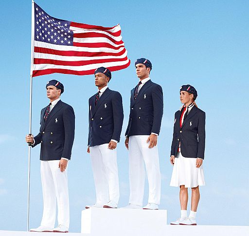
If there’s any silver lining here, it’s that the uniforms designed for the Ralph Lauren Olympic team are so blatant, it’s hard not to interpret this handout image as anything but a screaming red (white and blue) light that America, Inc. has spiraled out of control. I mean, why is the horse on the lapel so small? And, taking corporate license this far, what stopped them from doing the horse and mallet guy on the flag, as well?
(handout: USOC)


Reactions
Comments Powered by Disqus