February 5, 2012
Notes
Notes
Fly United

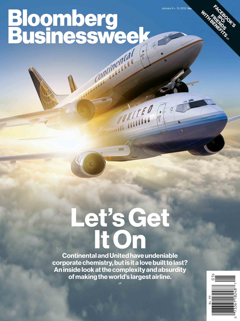
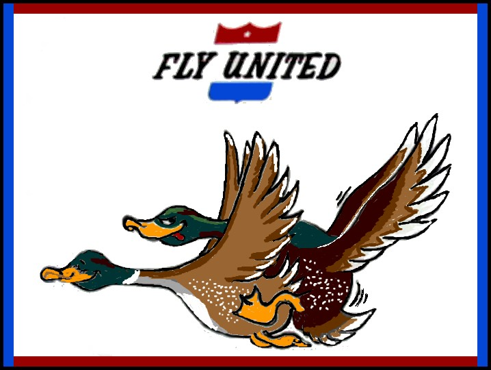
I love what Turley and Co. are doing at Businessweek with covers and layout, but isn’t this new and provocative offering of two plane humping pretty much a re-do of the old ’60’s “Fly United” poster?

Design process at Businessweek.
(illustration: Josh Turley/Josh Tyrangiel – Businessweek via Flickr)


Reactions
Comments Powered by Disqus