Notes
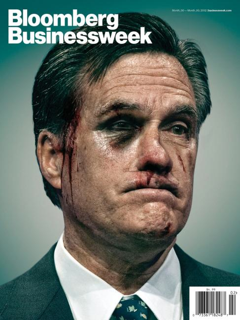
Populist Rage: The Rejected Bloodied Romney Biz Week Cover

On first pass, you might assume this has something to do with the beating Newt administered in the S. Carolina primary. Instead, it was designed almost two weeks ago for the January 16th issue (released on the 13th) but never ran.
ow that the Biz Week Creative Director has released this, it is being paired with the latest New York Magazine cover supposedly emphasizing how bloody the campaign has been. Frankly, though, I don’t think this election cycle has been any more vicious than in the past, and it may even be less so. That framing, on the other hand, seems to KO the obvious, which is the problem of Mitt and his bankroll. The magazine has said as much. According to Businessweek, the theme had to do with “how the GOP had turned on Mitt Romney and Private Equity.”
Bottom line, I can’t see this illustration coming to be simply based on the GOP candidate’s shoving each other around. What it seems to express quite well, however, is all that pent up rage directed toward Wall Street and the 1% (and whatever smaller fraction you can count Romney in).
(illustration: still looking)


Reactions
Comments Powered by Disqus