Notes
The Visual Politics of AOC’s Green New Deal Posters

Since its public introduction, the Green New Deal has been tarred by opponents as alien and un-American. As a result, it only makes sense that its proponents would frame the plan as both a historical progression and a paradigm shift.
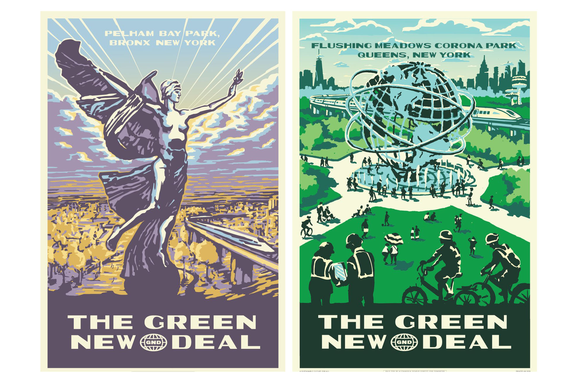
At the end of the summer, Congresswoman Alexandria Ocasio-Cortez revealed two new posters as part of her Green New Deal campaign. Created by the Tandem design firm, which also did work for AOC’s congressional campaign, these posters are the first of a series that will promote the initiative.
With their bold retro aesthetic, these posters connect the proposal to the language, principles, and mood of the original New Deal. The posters imitate the 1930’s style of the Federal Art Project posters created by the Work Progress Administration during the original New Deal, the most famous of which helped to popularize the National Parks. The visual style being transposed from the WPA posters to the Green New Deal features streamlined graphic representation of real places, Art-deco typeface, and three- to four-tone color pastel palettes. In a powerful way, this colorful and textured style echoes the optimistic messaging of the New Deal during the Great Depression.
Critics say these posters call up the wrong aesthetic from the 1930s, calling them throwbacks to Soviet propaganda. While the WPA posters from the original New Deal did share some stylistic techniques used by early 20th-century Russian designers, they were legacy centerpieces of “a truly original, American poster style.” Unfortunately, many contemporary Americans still associate this style with socialist “propaganda.” Similar charges were made against Shepard Fairey’s famous 2008 Obama “Hope” poster.
Ocasio-Cortez’s posters are not Soviet propaganda, however, nor are they carbon copies of the originals that inspired them. For instance, while the most famous WPA posters portrayed natural wonders of the west such as Yosemite and Old Faithful, the Green New Deal posters are set in New York City parks. As Ocasio-Cortez represents the Bronx and Queens, this is a logical place for the series to start. One poster depicts Pelham Bay Park, the largest park in New York City, and the other features Flushing Meadows Corona Park. Generic to many, both would be recognized easily by her constituents.
Instead of focusing on the beauty and environment of the national parks, the Green New Deal posters celebrate urban spaces. The Corona Park poster also depicts citizens walking and biking at their leisure, and it includes two figures, lower left, who look like they are planning to build. In both of these spaces, designers added high-speed trains into the parks. As if to offer a vision of a sustainable future with sustainable transportation, actual highways that border these parks are nowhere to be seen.
Both posters also are organized around historic monuments. The Unisphere in Flushing Meadows represents planet Earth. Its central placement reflects what is at stake in the climate change battle, and also its global scope. The World War I Bronx Victory Memorial from Pelham Bay, with its inspirational figure looking out over the park, communicates a feeling of optimism in the open wings, triumphant posture, and confident gaze to the horizon.
Ocasio-Cortez’s decision to reach back to the 1930’s for her vision of a sustainable future is part of a larger trend to turn nostalgia into emotional persuasion. Power-marketers such as Pepsi, Nintendo, and Netflix all latch onto warm feelings of nostalgia to attract consumers. Even President Trump’s promise to Make America Great Again harnesses a nostalgia for the past. But for Ocasio-Cortez, her posters recall the days when government did big, bold things and restructured the economy around the common good. It is a powerful message for a Congresswoman promoting radical systematic change.
In this case, the nostalgic style of the Green New Deal posters has become another slingshot in the contest over what Ocasio-Cortez’s and Bernie Sanders’s Democratic-Socialism means in America today. As AOC’s posters use the New Deal to focus climate change policy on sustainable practices, their retro aesthetic is primed to create an emotional response. Mindful of the political environment, however, they are fortified as much to elicit optimism as to counter anxiety.
— Daniel DeVinney
Posters: Tandem Design NYC.


Reactions
Comments Powered by Disqus