Notes
Nate Silver Closes the Curtain on Hillary
Nate Silver has been consistently optimistic about Hillary Clinton’s Democratic primary prospects. Even in pieces with dour headlines such as “Hillary Clinton’s Inevitable Problems,” Silver (following oddsmakers rather than pollsters) contends that “Clinton remains the heavy favorite to win the nomination,” asserting that “the challenges Clinton’s campaign has faced” thus far are anything but unexpected; they’re a routine component of the long campaign cycle. So it’s no surprise that Silver’s most recent post on Clinton’s positioning in the Democratic primary race resisted the “sky is falling” refrain emerging from most of the journalistic coverage of the campaign.
The article is a meta-news piece which asserts not only that Clinton’s positioning in the primary is better than the news cycle suggests; it also contends that the press has been cherry-picking poll results to make Clinton look weak, and asserts that the recent dip in her favorability numbers was kicked off by the widely-panned and mostly retracted New York Times article about whether or not a “criminal investigation” of her use of a private email account as secretary of state had been launched. Silver’s purpose is to intervene in what he terms the “poll-deflating feedback loop,” using careful empirical analysis of journalistic coverage of Clinton to make the case that Clinton’s dip in the polls is mostly a product of inaccurate and unfair reporting.
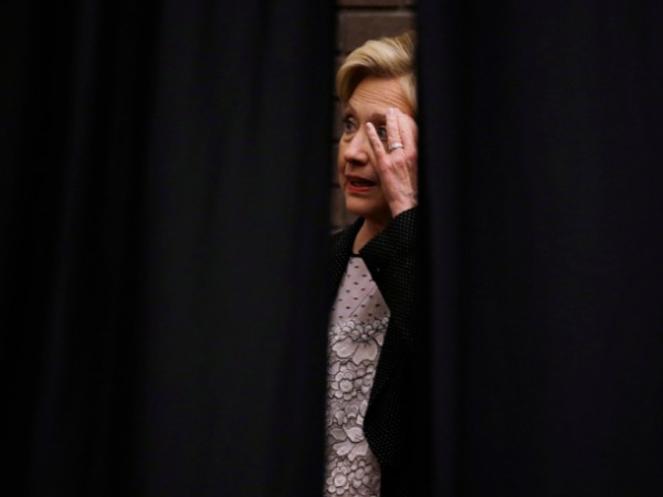
Since the explicit aim is to challenge the dominant news narrative currently framing Clinton, the choice to lead the piece with a photo of a curtain literally closing on Clinton is both puzzling and problematic. The Democratic front-runner is shrouded in black, with her hand touching her temple in ostensible befuddlement.
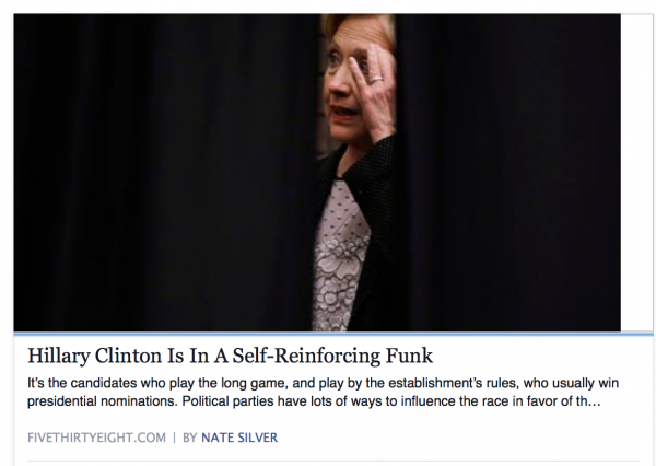
The visual narrative his photo choice creates directly reinforces the framing that his empirical analysis is meant to challenge—Clinton’s negatives have nearly engulfed her as she looks on, perplexed and paralyzed. And the photograph not only frames this particular story on Silver’s website. It is also the visual hook when the post is shared on social media:
A supporter wanting to share Silver’s analysis of the skewed Clinton media coverage can’t do so without visually reinforcing it. Political strategists have long recognized the ways in which the visual dominates the verbal in campaign coverage. Ronald Reagan’s communication team famously choreographed all of his public appearances, supplying the White House press corps with engaging imagery to accompany their stories.
As Reed L. Welch notes, Reagan’s advisors:
felt so strongly about the importance of image as to believe that the impact of a negative story from a reporter could be counteracted if the story was accompanied by positive visuals of Reagan; they thought that the public would remember the visual but not the reporter’s message.
To be sure, the inverse of that assumption is also true.
We are left wondering, then, what the motivations were in choosing this particular photo as a banner for Silver’s otherwise positive coverage. Was it simply a misguided attempt to match his image to his headline? Or perhaps a cunning ploy which allowed him to play both sides of the political field—pandering to Clinton’s supporters and antagonists simultaneously? Or, in the end, does Silver’s story illustrate how difficult it is for the media to resist the narrative of Clinton as a self-defeating campaigner, even when the data resist that conclusion?
— Karrin Anderson | @KVAnderson
(photo: Morry Gash/AP caption: Democratic presidential candidate Hillary Clinton waits behind a curtain to be introduced at a rally at the University of Wisconsin-Milwaukee on Sept. 10.)


Reactions
Comments Powered by Disqus