Notes
What's Up With Those Middle East Edition Businessweek Covers?
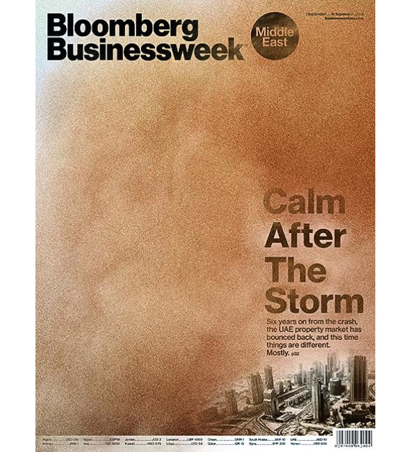
I don’t know, looking at these covers (the first three, from about every other edition the last three months) they seem unusually inflamed. Now I know what you’re going to say: as the region has been racked by violence, it makes sense that it would find a way to surface — even if expressing less volatile subject matter. Sure maybe, considering the most recent issue (9/1) actually has to do with the property market in the UAE (under that sand storm) having fully bounced back from the crash six years ago.
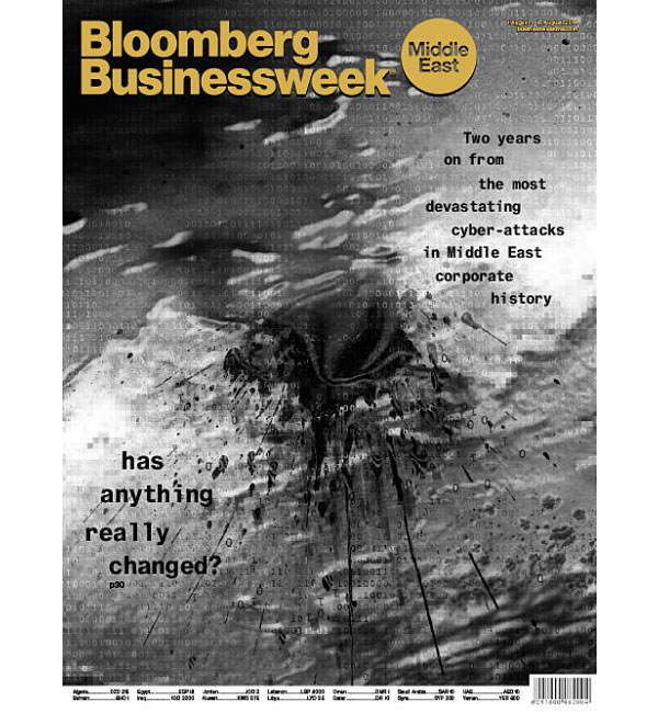
The example before that, 8/4, has what looks like a bloody stain, or a gunshot wound on top of what could also be read as an unearthly-looking regional map from space.
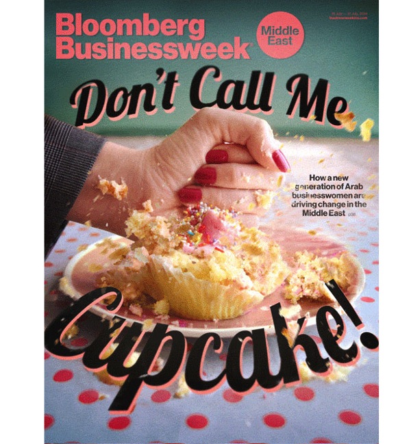
This cover, from 7/21 — on the rise of female entrepreneurs — has a woman’s fist demolishing an endearment. (I don’t know if this force is consistent with either empowerment in the region or feminist treads there.)
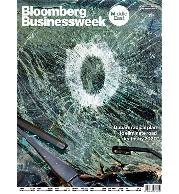
Finally, the cover from 4/16 addresses a radical plan for the elimination of road deaths in Dubai. I’m wondering, are road deaths such a critical problem there? (Maybe so.) Doesn’t the photo-illustration also look like a gunshot, however, or (again) like some kind of shattered map or black hole? In agreeing that chaos is oozing everywhere, though, could the fact these images emanate from a Western publisher play a role at all?
(cover illustrations: Bloomberg Businessweek magazine, Middle East edition. Art Director: Steven Castelluccia)
Reactions
Comments Powered by Disqus