Notes
David Schalliol from Chicago: After the Projects, New (Physical and Emotional) Landscapes
This is the fourth in a series of posts by sociologist/photographer David Schalliol documenting a South Side Chicago neighborhood being demolished to make way for a Norfolk Southern freight yard. As the series unfolds, it tracks the urban migration of its residents and the visual process of documenting the Chicago Housing Authority’s evolving “Plan for Transformation.”
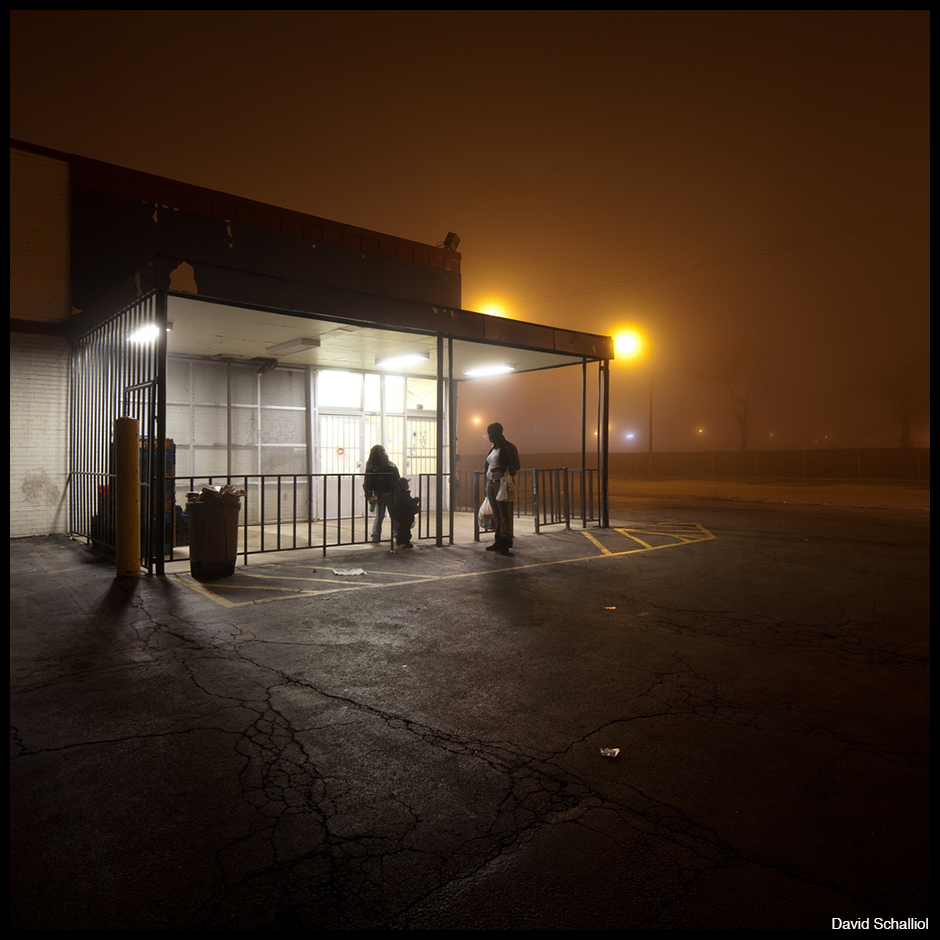 A family exits Sunrise Supermarket, a grocery store that once served residents from the Ida B. Wells public housing project in Chicago, Illinois. Both are gone.
The community I am documenting has reached a tipping point. Today, it appears more like a ghost town than a neighborhood. While this change raises questions about how to photograph a place that seems to be disappearing, it raises another problem: How do I maintain a project where the people are moving someplace else?
At the same time, changes in the landscape offer more opportunities for visual contrast and the ability to link personal growth to the change in geography. These approaches are not only the core of many landscape projects but are also basic storytelling techniques.
Being particularly interested in the relationship between people and place, I often use a new locale to challenge the grammar of another, including: how details like desire lines or worn patches of paint demonstrate routines; how the relationship between buildings and the area around them produces a sense of place; and, of course, how the condition of a place signals socioeconomic conditions. If done well, documentarians can use these shifts to challenge elements, otherwise taken for granted, of “landscape-as-context.”
I previously engaged this issue in documenting the Chicago Housing Authority’s Plan for Transformation, a massive, long-term initiative to “renew the physical structure of CHA properties,” “promote self-sufficiency for public housing residents” and “reform administration of the CHA.” That plan has been most noticeable to Chicagoans in two ways: the CHA’s demolition of its signature high-rise public housing developments, and in private developers’ construction of the low- and mid-rise mixed-income housing developments that replaced them. The driving idea behind this policy reversal is that the high-rise developments “ghettoized” residents, isolating them from those not receiving housing assistance. Among other objectives, the mixed-income communities are intended to provide opportunities for interaction between residents who can afford to pay the market rates and those who receive direct housing assistance.
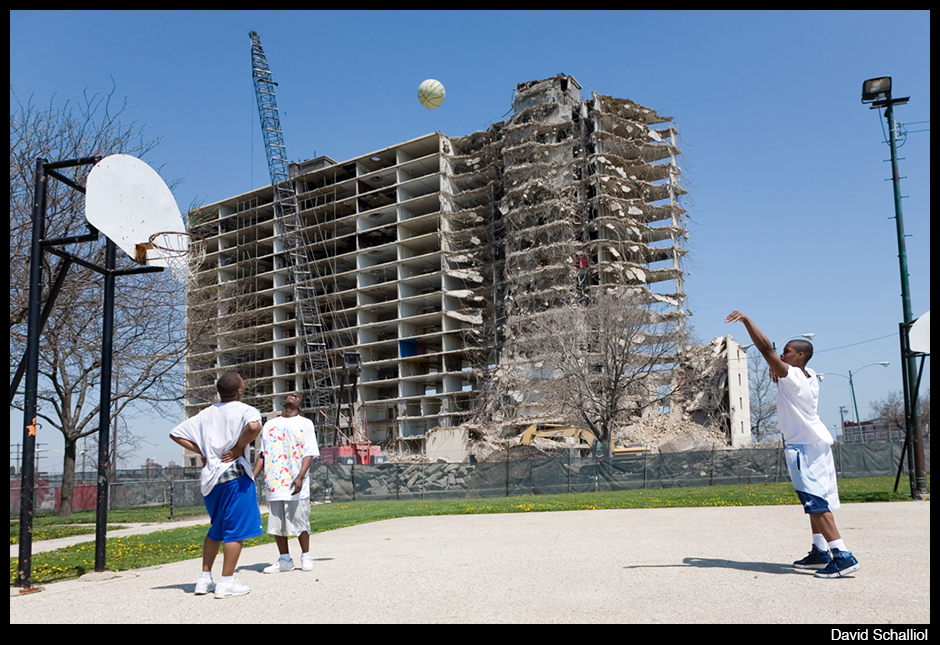
Teenagers play basketball while the Stateway Gardens public housing project is demolished in 2007.
While there is solid coverage of the pre-demolition and demolition stages, a problem in making sense of the Plan (one I’m having, too) is how to document the entire transition. The stumbling block seems to be illustrating life in the new mixed-income communities; documentation of the current situation is always more coda than movement. Yes, management companies are reluctant to provide full access to facilities and, yes, residents are concerned that participating in a documentary project will get them evicted. Still, I believe that the larger obstruction is actually caused by shifting aesthetics.
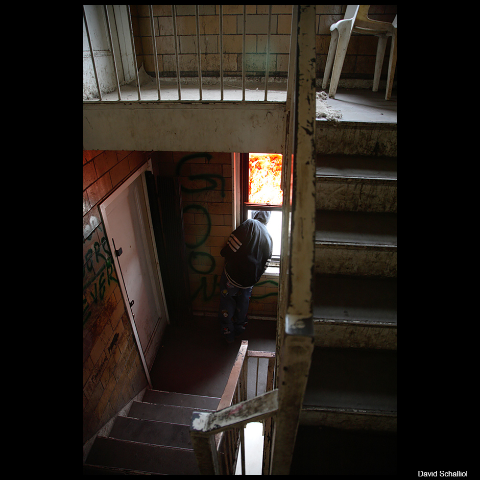
An Ida B. Wells resident peeks out a stairwell window to see what produced a sharp noise.
Like many others who photographed in the now-demolished public housing projects, my Plan for Transformation photographs highlight the relationship between the community’s social and physical elements. The fact the former developments were derelict was legible evidence of the lack of institutional support provided to residents. As a result, locations like Cabrini-Green and the Robert Taylor Homes became internationally recognized icons of state failure. Initially hailed as the future of urban housing, they were ultimately lambasted in the news and exploited for film sets.
The new mixed-income developments are a clear contrast. At first glance, they are not so different from many of the city’s contemporary condominium developments. They are remarkably different from the old tower blocks, but they are also bland environments of fresh paint and mortar. Constrained by limited budgets, they appear thin and fragile, but they still have the cleanliness of new construction.
Of course, these qualities offer visual opportunities to express the Plan’s tentative nature, but the new “neighborhoods” don’t clearly express the institutional harshness faced by residents. What the façades don’t show is that the institutions running these developments can evict residents for activities that would seem constraining to the typical renter, including rules limiting children living with their mothers or how porches can be used. With the threat of eviction comes the constant concern about being expelled for unintentionally running afoul of the contracts – or for misunderstandings with residents from other socioeconomic groups.
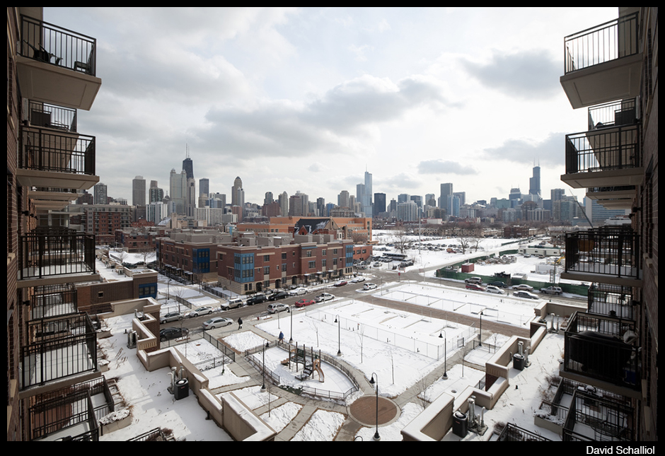
The view from one of the largest mixed-income developments, located on the former Cabrini-Green site.
The style of the demolished public housing developments was likely another contributor to the half-finished documentation of the Plan for Transformation. Surely, many documentarians are drawn to the “other” or the “exotic.” While the Robert Taylor Homes were foreign to most Americans, the new environment doesn’t provide the same “thrill.” A more forgiving reading is that the new environments fall too far outside the canon of social activist photography to be compelling subjects. Because the developments are not as obviously critiqued or identified as requiring “help,” those with social objectives are less likely to tell the full story of the Plan.
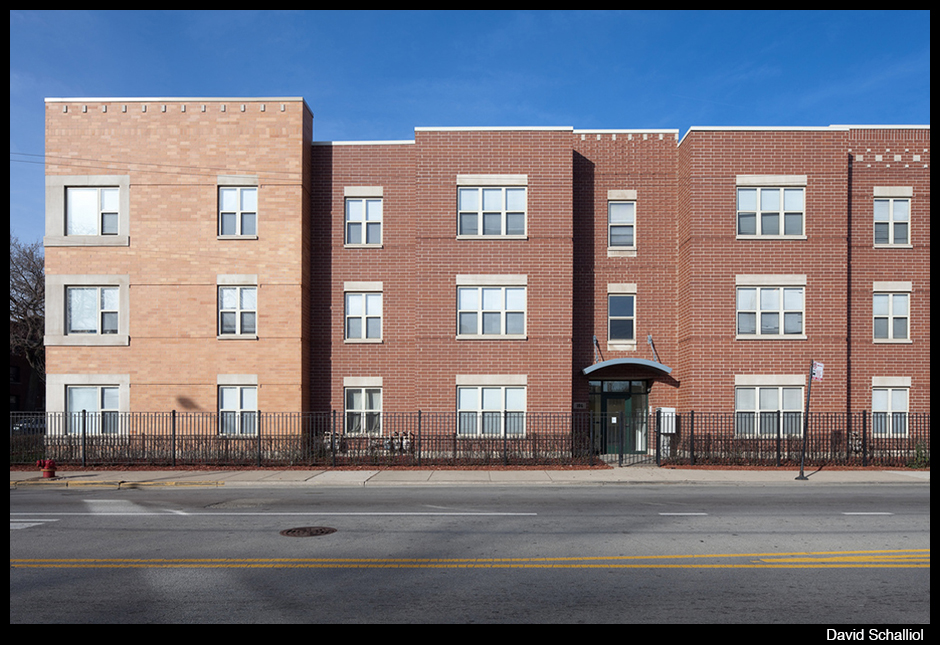
Mahalia Place, a portion of the Legends South development, primarily located on the site of Robert Taylor Homes.
In my current project, residents are not making such dramatic moves, but the moves they are making still produce a considerable challenge. One consequence of their homes’ low market value is that scores of residents are moving to neighborhoods that look and feel like this one did just a couple of years ago.
Moving between the neighborhoods is something akin to time travel. The current landscape of the old neighborhood is a broad, almost uninterrupted plane, but residents’ new neighborhoods are like their neighborhood used to be: seemingly linear, guided by the street and the houses that flank it. The result is that the appearance of the built environment is almost a constant for most residents. They left their neighborhood before it truly collapsed, so while the buildings around them have changed, the overall visual affect is similar. The new contrast is largely determined by how residents connect with their new neighborhoods and maintain friendships with their old ones.
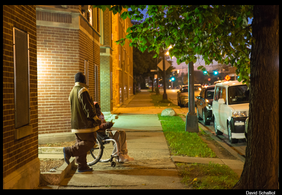
Displaced residents standing outside their new building.
Still, the environment has shifted, and new places come with new issues. In some ways, this is a practical matter. In the old neighborhood, I intimately know the details of shadows, how peoples’ use of space changes with time. This is important to the understanding of this place. As residents move elsewhere, I need to reinvest in the project – almost start over somewhere new – in order to understand the new patterns and how they affect everything from opportunities to interact with neighbors to how to receive newcomers. One major difference this time around is that I am not only learning about a new place, but also that new place in relation to the old one.
The interior spaces provide more continuity. While the geometry of rooms have changed, the experience of the interior spaces is homogenized by the continuity of furniture, personal belongings, and even the people who occupy the new places. Here, the remainders of designed spaces often generate changes: a room where furniture won’t quite fit or nooks asking for a creative use. Other times, room placement produces the changes: a bedroom that’s now by the kitchen or a sunroom that’s now off of the family room affects where people congregate. Regardless of the character of the new place, the main contributor to continuity and contrast in the social life of a home is often how much the placement of the television (or at least the biggest one) corresponds with how it was in the previous residence.
As the days get longer and warmer, I will also need to get a handle on places that are neither fully indoors or outdoors, including porches, stoops and backyards that also redefine how people use interior and exterior places in the warmer months.
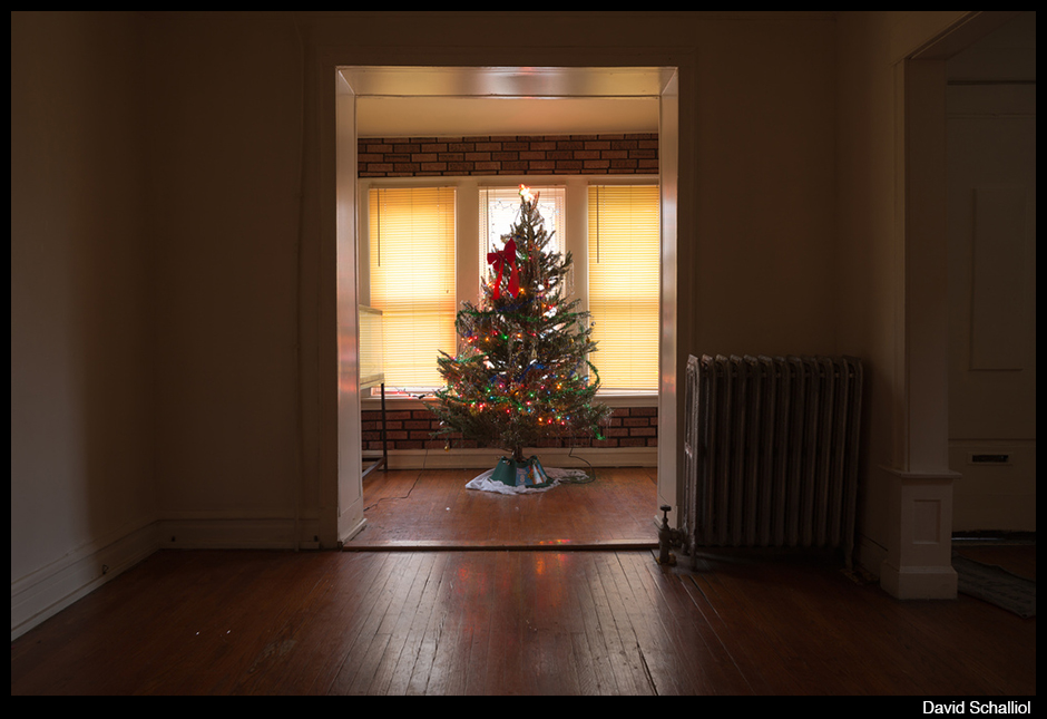
The first Christmas in a family’s new house.
On a personal level, I have a sense that my connection to the former neighborhood – a special place bounded by railroad tracks – isn’t replicated elsewhere, And the work is different now: it’s less a need to understand life in a place than to understand how life changes when one leaves a place with so many attachments. My experience of loss could never equate with those who made the neighborhood their home, but I am affected by leaving there, and my work is too. Hopefully, that difference will offer new motivation, insight and new approaches to visualize what is taking place.


Reactions
Comments Powered by Disqus