Notes
When Words are Photoshopped
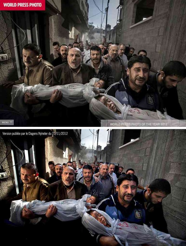
Yet another prize winning photographer has been accused of visual deception. Subsequently, Paul Hansen’s World Press Photo of the Year passed the forensic review that was set up hurriedly–by WPP–to address the scandal, but it has become clear that the image was substantially “improved” in post-production. All commercial photos are enhanced, and few news photos have ever appeared without some artistic manipulation, so there is at the least a sliding scale involved. At some point, however, art becomes deceit, and with that the integrity of the press as an institution is at risk. Thus, the press needs its own watchdog, and from the beginning of photojournalism there have been those who were happy to question whether the images in the news were telling the truth.
I’m fine with that, but what I don’t get is why captioning so often gets a pass.
This photo was captioned by Time as, “April 30, 2013. Israeli security forces arrest a Palestinian man during clashes with Jewish settlers, left background, near the Jewish settlement of Yitzhar, near Nablus.” Now, the photographer and magazine were playing by the rules, carefully identifying who, what, when, and where in sufficient detail to place the photo within the event being covered. We now know that the photo was not taken on April 29th and that it was near Yitzhar (the Jewish settlement) near Nablus (the Palestinian city) and not near some other settlement or city. Given either forensic or historical questions, those could be crucial details.
Those are not the only questions that apply, however. There also are political and moral questions, for example. In respect to those questions, a very significant detail has not been identified. Look closely: the man is double over in pain while trying to get something out of his eyes. He is a large, well-muscled man yet unable to resist the two soldiers grabbing him, so the pain must be debilitating. Now look closer still: the two soldiers are trying to spray something into his face. The one is spraying–you can see that he is holding and firing a spray canister, and that the foam or mist is coming out as white blur. The other soldier is trying to hold and turn the man so that the first can hit him directly in the face. Hit him squarely in the eyes, that is, and for the second time.
The caption did not say, “April 30, 2013. Israeli security forces try to force a second dose of pepper spray into the eyes of a Palestinian man during clashes with Jewish settlers.” That would be the more specific, more accurate description of what is being shown. It also would shift the sense of political blame: instead of a man being “arrested,” as if a criminal, we have Israeli soldiers siding with the settlers who rioted following a stabbing. (The stabbing of a settler was of course criminal and should lead to an arrest, but ask yourself how rioting following a crime would be treated in your town.) Instead of settlers violating the rule of law, here the Palestinian is the sole law breaker. Instead of soldiers attacked a wounded man to deliver a second dose of punishment, we have merely an arrest.
The saving grace of photographs is that they can show what is happening contrary to the interpretation that is applied to them. Even so, as many commentators have pointed out, captioning can significantly influence what is seen, what is remembered, and how it is used. The caption tells you both what to see and what to ignore in the photograph.
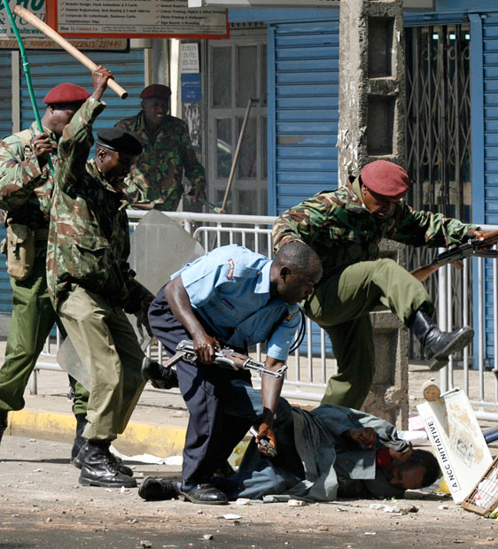
Most of us would see a vicious beating. The London Telegraph apparently wasn’t so sure, as it captioned the photo this way: “At least five people were killed when police fired on about 100 Muslim youths in the Kenyan capital who were protesting against the arrest of a radical Jamaican-born Muslim cleric whose teachings influenced one of the 2005 London bombers.”
Well. I guess we are to think that they guy on the ground is one of the lucky ones–after all, he’s still alive, isn’t he? (Barely, I would guess.) And if he is getting a good beating, perhaps we are to think that it might be deserved: after all, he is associated with one of the London bombers. The paper is showing the violence, of course, but it also is coaching the viewer in how to look past it, minimize it, pretend that even though nasty things happen on behalf of homeland security one really doesn’t have to say that they happen.
So it turns out that there really are two sets of rules: the rules that guide reporting what is supposed to be said, and the rules that ensure that some things are not said. That second list probably is longer than we would like to think (speaking of learned denial). To give one indication, in my own not-scientific survey of documentary images, it seems to me that police brutality often is not mentioned. To the credit of the news organizations, it is shown, but it it not mentioned. That strategy probably is safer for the news organizations–they are less likely to be accused of being “political,” or of having their photographers beaten. But the omission is not just a prudent division of labor: it schools the public in seeing and not saying. In short, it encourages the worst form of bystander behavior.
Words were being manipulated long before photography existed. They still are being manipulated with all the power and subtlety that we expect of Photoshop. When attached to a photograph, they can seem all the more innocent, as if providing nothing more than background information that can be checked instantly for its accuracy. Except that those words often are not innocent, and they are persuading us to not see, not check, and not ask.
To read a better caption of the second photo, go here. Despite being a conservative paper like the Telegraph, the Wall Street Journal is more descriptive, perhaps because the cleric’s connection was with London rather than New York.
— Robert Hariman
(cross-posted from No Caption Needed)
(Update: caption attributed to Corbis corrected; it was captioned by Time.)
(photo 1: Nasser Ishtayeh/Associated Press. photo 2: Thomas Mukoya/Reuters.)


Reactions
Comments Powered by Disqus