Notes
Modernism: Past the Dynasty and the Mad Men
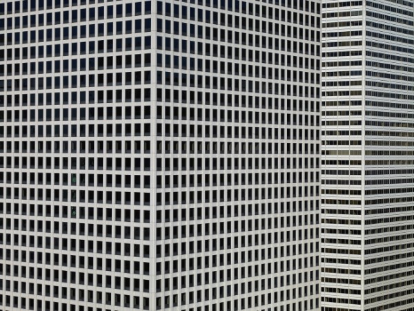
Images like this one used to be depictions of the impersonality, alienation, and anomie of modern life.
Perhaps the retro chic and post-feminist nostalgia of Mad Men has changed the way we think about mid-century modernism, but the show is more likely to be a symptom than a cause. For whatever reason, these completely uniform, featureless, rectilinear, steel and glass cages no longer have to carry the symbolic baggage of an earlier era’s popular sociology. The Organization Man, The Man in the Grey Flannel Suit, The Lonely Crowd, Death of a Salesman, and other titles of sixty years ago documented the anxiety and desperation that hung like second hand smoke throughout the new society of imposing office towers and distant suburbs.
Individuals still have their preferences, of course, but modernism is now a period style rather than a dynastic order. The technologies, architectural designs, and engineering have become ubiquitous and are used to support a wide range of artistic and political initiatives, while also no longer being directly coupled to either capitalist hegemony or authoritarian regimes. (Le Corbusier once said the choice was between “Architecture or Revolution,” and, not to be outdone, the Soviet Union and China converted their revolutions into disastrous schemes for centralized, state-controlled modernization.) The modernism that was the leading edge of 20th century development has been relegated to the background in the 21st.
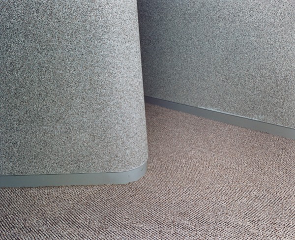
Just like the carpet at the office, you might say. And with that demotion in status, it may be time to take another look. Ironically, modernism’s abhorrence of decoration proved to be no safeguard against other kinds of excess, including hubris. But cut back to scale, the functional simplicity, elegant abstraction, geometric patterning, subtle textures, and other characteristic features of modern design still are capable of evoking a sense of beauty and even of serenity. Take away the imperial power, crushing hierarchies, and totalizing extension into all aspects of the lifeworld, and you are left with a sculpted space and muted tones that could nurture both comfort and creativity.
As with the two images above, modernism always was about radical manipulations of scale. The same aesthetic could be found in a gleaming skyscraper and the chairs or staplers inside the building. Usually it was about scaling up, however. The sequence of images here provides a scaling down, much like the change in status that they represent. One thing I like about the second picture is that the aesthetic is taken down yet another notch by the slight fraying of the wall covering along plastic baseboard. Look closer still and you can see the line separating two swatches of carpet on the left. Whether the original piecework or evidence of deterioration over time, these details give us a modern environment that isn’t so far removed from the human condition after all.
This corner, like the building above, will have become almost invisible. Nothing distinctive to be seen either on the skyline or down the hall. They haven’t just faded into the background, they now are the background for another era still struggling to define itself–in fact, still struggling to even begin to become something other than another repetition of a culture hanging on past its time. Perhaps one small way out of that dilemma is to see all of modernism as a useful backdrop to a future yet to be designed. And when caught in one of those moments when the mind seems stuck, perhaps we might look a little closer at the surface of those things now taken for granted. Things that, once the old urban angst no longer applies, we can see both for what they are and for how they might suggest better things yet to come.
— Robert Hariman
(cross-posted from No Caption Needed)
(photo 1: Michael Wolf, The Transparent City, photo 2: Lars Tunbjork/Agence VU, Office. Both images are part of the slide show “A Major Case of ‘the Mondays’: Photographs of Office Life,” curated by Myles Little, Time Lightbox.)


Reactions
Comments Powered by Disqus