Notes
Horse of a Different Color: Charlotte Observer's Creative Contribution to Photo Processing Debate

You think photo editors aren’t also thinking — a lot — about the debates over image processing? For several years now, the “Daily Edit” slide show at the Charlotte Observer has been a regular stop for me. It’s typically a smart compilation of 30-50 newswire pics, albeit with a generous sprinkling of sports photos. (Also, they are one of the few news photo galleries that publish seven days a week.)
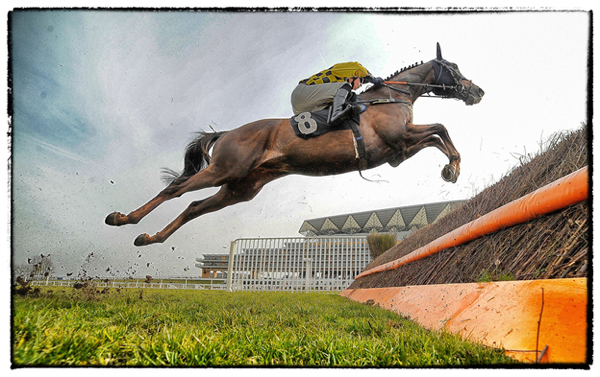
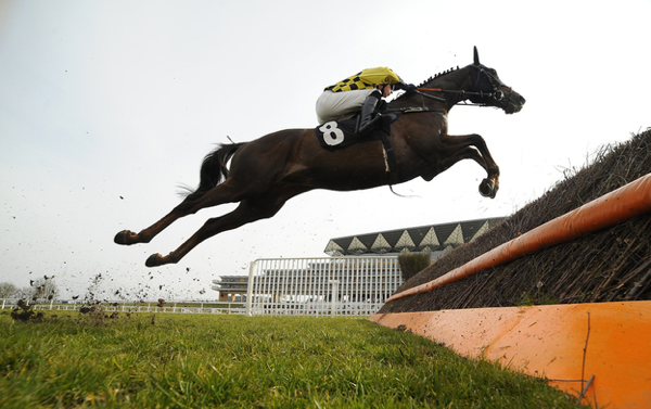
So, doing my usual pass through the Observer’s pics Sunday night, I came across this clever move. Without warning (except for a brief notice in the caption of the first image) the photo above appeared as the 17th photo in the gallery. Fair enough. But then, clicking to the next photo as one does in that speedy fast and half-alert mind, the photo just below appears:

What struck me immediately was: what a wonderful way to cue the public that something is up with news photography — and to make it known with such a simple (and essentially non-verbal) illustration.
For several years now, I’ve been following the conversations and alarm about iPhone and Instagram and the toning and filtering of pictures — often focusing on highly notable examples such as this year’s World Press Winner. And while those debates typically involve a more abstract ethical discussion over the shifting of color or light or contrast from something more “true to life,” what mostly concerned me, as consistent with The Bag mission, is context, and what that photo now communicates that it might not have before from a content standpoint.
In the case of this pairing from Ascot — largely because the photo isn’t about life and death; because the photo isn’t ideological or political, and doesn’t involve dead babies being marched through the streets — the editors at The Observer offers a case example to consider not just the degree of difference from “the truth,” but how the processing relates to that content difference.
The first thing that’s apparent is that the processed shot gives your eye more places to go. That’s in contrast to the second shot which being more monotone — and the horse, the central feature, being more a silhouette — means the eye and the brain is going to dispense with the stimulus pretty fast. In the first shot, on the other hand, my eye wants to inspect the flying dirt; the variation of light in the grass; the construction of the barrier with the two bright orange and contrasty horizontal elements (and then, the twigs); the gate; the sky, which far from foggy grey actually has its nuance, too; the triangular architectural elements on the club house which now seem to pop out; and, of course, the stretched skin of the horse’s flank which is now fascinating.
Should I be predisposed to disapprove of the processed version for some kind of corruptibility? Should I be prepared to appreciate it because the heightened and more engaging details — not being social or political in nature — are more benign? Should I still have an issue because the contrast on steroids and what seems like almost-graphically illustrated elements (such as the twigs flying around the front hooves, or the magic mushroom-y magic realism of the grass) makes this feel a little like a cartoon or a movie frame when you’re wearing 3-D glasses?
What do you think? But more importantly, what do you see in the first image you don’t see in the second, and how does it make the photo more worthwhile? or informative? or better? or worse?
(photo 1: Alan Crowhurst/Getty Images for Ascot Racecourse caption: ASCOT, ENGLAND – APRIL 07: (EDITORS NOTE: This image was processed using digital filters) James Davies riding Escort’Men clear a fence in The BMW Ascot Novices’ Handicap Steeple Chase at Ascot racecourse on April 07, 2013 in Ascot, England. photo 2: Alan Crowhurst/Getty Images for Ascot Racecourse caption: ASCOT, ENGLAND – APRIL 07: James Davies riding Escort’Men clear a fence in The BMW Ascot Novices’ Handicap Steeple Chase at Ascot racecourse on April 07, 2013 in Ascot, England.)


Reactions
Comments Powered by Disqus