April 23, 2013
Notes
Notes
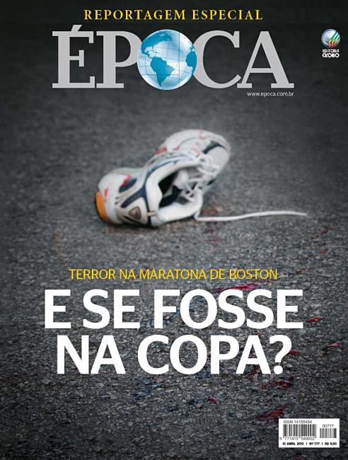
Blood and Sneakers: Bring on the Magazine Covers

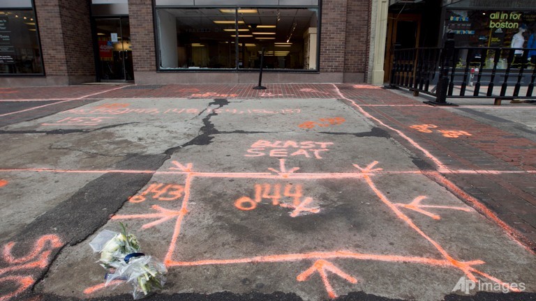
With all the upset over graphic photos, I’ve been looking forward to the magazine covers to bring perspective and eloquence to the Boston Marathon attack. Época, from Brazil, offers this along with two other versions (1,2). Perhaps blood, feet and sneakers are the dominant iconography. Or maybe the illustration is leveraging the bloody images. Either way: no figures, no limbs. And isn’t that what good illustration or photo-illustration does — provides us the invitation to fill those shoes with our own imagination and empathy? I also admire how the randomness of the shoe shifts the trauma back to sports and to the tradition, which in that city means everyman and every road.
(credit: Marcos Marques – art director)


Reactions
Comments Powered by Disqus