Notes
Thoughts on the Racist Businessweek Housing Cover (and Predecessor)


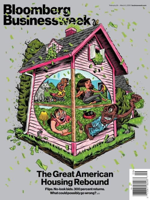
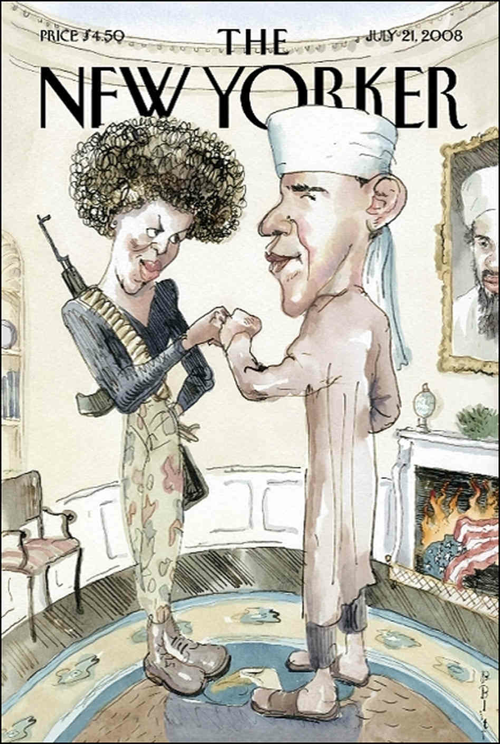
Call it a lesson in editorial overconfidence, Businessweek having been on such an extended streak of bold/edgy and clever covers with such creative design that they were probably feeling they could “do no wrong.” (1, 2, 3 and Coverjunkie’s favs.) Not since the New Yorker’s “Obama as terrorist” cover during the ’08 campaign have we seen an illustration miss the turn that badly in terms of playing on stereotypes. And, not surprisingly, like the New Yorker, their cover hits the racial third rail.
Based on the cover alone (these illustrations having a life of their own in the media/social media sphere no matter what the article happens to say), there is no way to tell if the illustration is decrying the practice of targeted and discriminatory lending practices by playing off white or conservative stereotypes to make a point or they are saying, in the most flat-out and racist way, that the restoration of “fair practice” to the lending marking portends that “low class minorities are going to crash the economy AGAIN.” (And what leaves them even more naked is that the associated article about the Phoenix market doesn’t address the issue of lending and race at all.)
Such is the danger of playing with stereotypes at the level of political illustration — or more specifically, cartooning(!) which deepens the degradation — especially coming from the white media establishment.
I imagine if we spoke to the editors at The New Yorker today, they’d (still) tell us it’s obvious Obama wasn’t a terrorist and that Michelle wasn’t Angela Davis. Of course, it’s at least two inaugurations easier to see the Osama/Obama cover now as just playing on stereotypes, all that Muslim and birther hysteria surrounding the election as buried now as bin Laden himself.
But you know what makes this Businessweek cover so much (permanently) worse? In the case of the New Yorker cover, it was ultimately clear the allusions were unintended because it was floated out there by liberals. In the case of your Businessweek brain leak of black folks going to town on the banking industry and the government’s dime, it may be that the illustrator and Businessweek’s “progressive” design staff had parody purely in mind. That’s never going to wash with visual media consumers, however, knowing it’s not an unlikely sentiment around the finance world.
Update, 4:45 pm: Just like Businessweek did, we want to emphasize that the slur here was all the publication’s doing and not the illustrator’s. Here is the statement Bloomberg Businessweek sent out from the illustrator: “The assignment was an illustration about housing. I simply drew the family like that because those are the kind of families I know. I am Latino and grew up around plenty of mixed families.”
(illustration 1: Andres Guzman illustration 2: Barry Blitt/New Yorker)


Reactions
Comments Powered by Disqus