Notes
Best of the Bag, 2012: The Campaign Silly Season, Self-Inflicted and Imposed
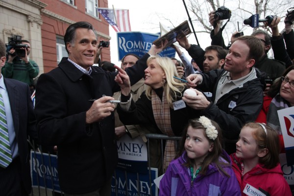
We’ve often said that Mitt Romney couldn’t hold a picture on his own – that there is something inherently uninteresting and awkward in the way he occupies photographic space. True to form, some of the best photos of the candidate employ props or other people doing interesting things. The above photo is one of my favorites, taken by The New York Times’ Jim Wilson during the primary season.
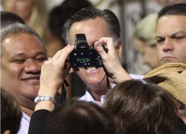
We ran this one on our Tumblr site. It seemed to capture Romney’s visual vacuity in a very obvious way. But there was another visual factor of the election, one that was rarely talked about and rarely exercised on the Obama team: the visual ridicule heaped on the GOP in general and the Romney/Ryan in particular.
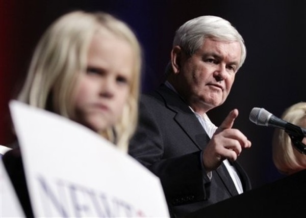
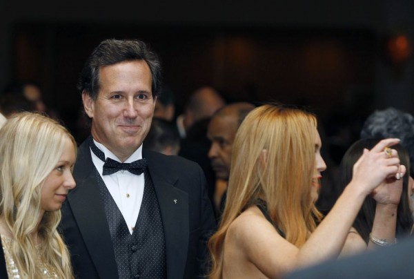
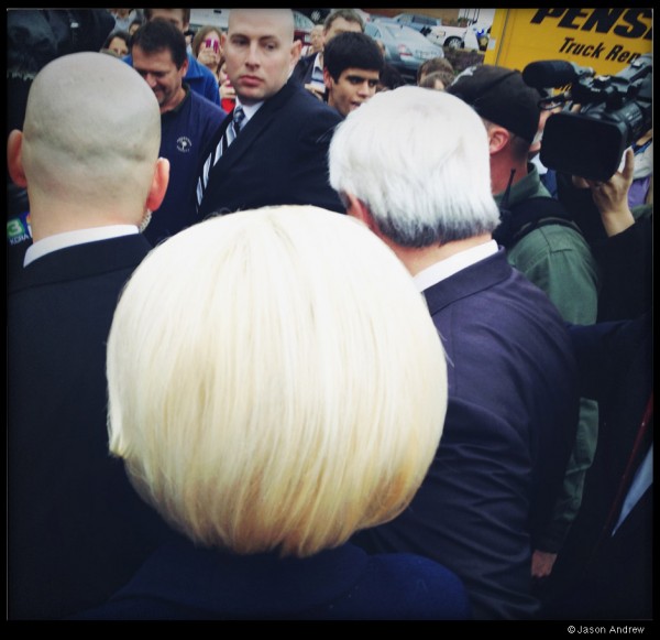
Perhaps it was driven by the over-long, character centered GOP primary season that gave us “Children of the Corn Newt” and “Star-Struck Santorum.”
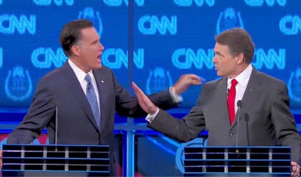
It could have been the $10,000 bet, the inability to remember which government department you’d eliminate, or the odd displays of temper from the normally calm Mr. Romney.
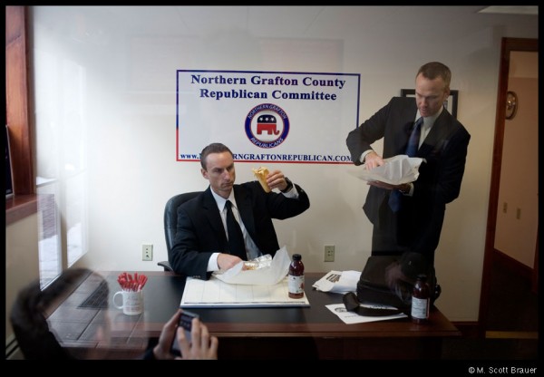
The fun wasn’t restricted to candidates. Their wives and staff took some visual poking as well.
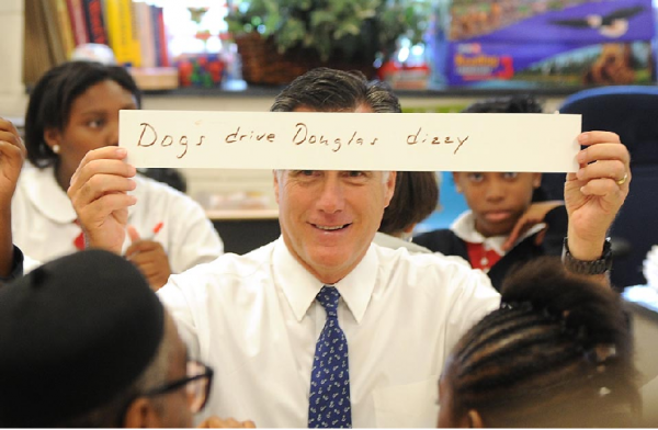
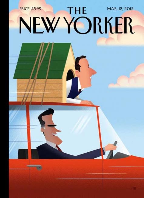
Still, you had the feeling that it wasn’t just the media. That the candidates often set themselves up. Here, Gov. Romney made an awkward visit to a Philadelphia school only to remind the world of his exploits with Seamus the dog.
Call it a sense of humor or a self-inflicted jab, the joke wasn’t going away in any case.
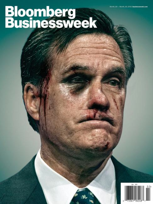
In fact, by the time Romney survived the primaries and was close to claiming the nomination, this rejected Bloomberg cover seemed to sum it up.
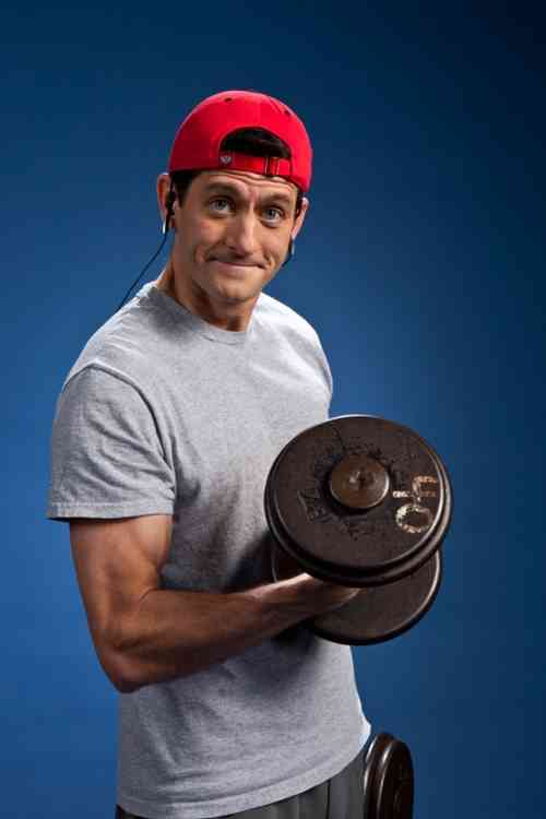
But when Romney attempted to impart conservative gravitas to his bid for election, the visuals wouldn’t back him up. The collection of Paul Ryan workout photos, made the candidate look more like Screech and less like a potential VP.
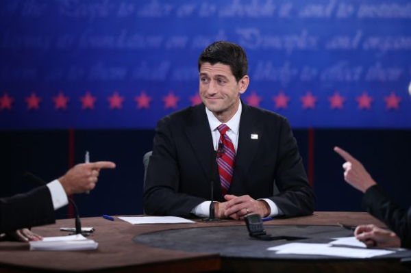
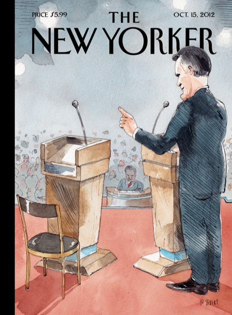
It didn’t help that he was schooled and derided by Joe Biden during the debates.
Romney Ryan got little visual respect in the past election. Much of this was self-inflicted, some of it unfair, but still, not something the Obama team had to suffer from the mainstream media (as opposed to the right wingers who regularly made Obama into Hitler, a witch doctor, the Joker). Perhaps the Obama campaign was more nimble, more aware of how events big and small translate into photographs and visuals. Perhaps they just didn’t find themselves in ridiculous situations as often as the GOP. Of course, there’s always an exception to the rule, but at least this visual jab falls under the category of “self-inflicted” with an assist.
(Photo 1: Jim Wilson/The New York Times Photo 2: Mary Altaffer/AP Photo 3: Chris Carlson/AP Photo 4: Haraz N. Ghanbari/AP Photo 5: Screen shot via CNN vide. Photo 6: Jason Andrew Photo 7: M. Scott Brauer Photo 8: Clem Murray/Philadelphia Inquirer/MCT/Zuma Press Photo 9: New Yorker cover illustration by Bob Staake Photo 10: Bloomberg Businessweek Photo 11: Gregg Segal for TIME. Photo 12: Justin Sullivan/Getty Images Photo 13: New Yorker cover illustration by Barry Blitt.

Reactions
Comments Powered by Disqus