Salon
BagNewsSalon: The Visual Politics of Occupy Wall Street
In Collaboration with Open-i
The most recent BagNews Salon, held on December 4th in collaboration with Open-i, brought together photographers, visual academics and informed participants to discuss the visual politics of the Occupy Wall Street movement. Watch the full archive or read salient quotes from the conversation below.
The BagNewsSalon, a program of BagNewsNotes, is dedicated to understanding how the visual media frames the key social and political events of the day. The Salon brings together the world’s leading photojournalists, visual academics and other informed observers to analyze 9 still news and political images in a 90 minute on-line webinar. An invited panel will discuss the visual culture of the Occupy Wall Street Movement.
Images and Selected Quotes
Co-Produced for BagNews by Ida Benedetto
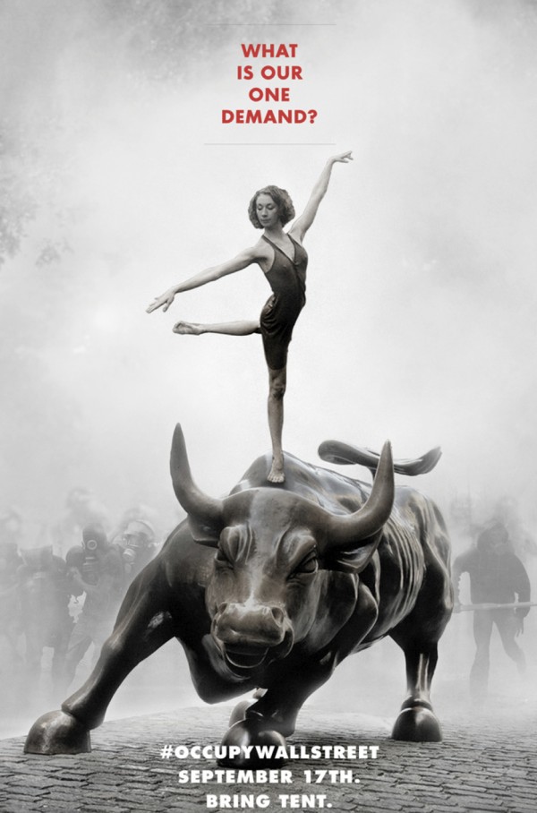
(photo: Adbusters. caption: Produced in June, 2011 promoting the start date of the occupation, September 17, 2011.)
James: It’s classic bread and roses. It’s saying you can have political struggle and roses too.
Alison: This image is very clear in the sense that there are two oppositional figures; there is the Wall Street bull that is domineering and then the ethereal ballerina on top. The image does a good job of suggesting that politics can be shifted toward dialogue and away from the aggressive stance that the bull embodies. At the same time, there is something slightly unfortunate about the delicacy of the ballerina, potentially even infantilizing. There is a risk that the gender discourse overrides the political message.
Spencer: When you look at this ad, it could be a Rolex ad. It’s extremely shrewd marketing.There is obviously some big money and some real brains … behind this. The Occupy Wall Street that I am dealing with on a daily basis is pretty gritty, grungy and a little chaotic. As much as I have sympathy for it, it never came across as sophisticated at all. This ad to me says that there are some strings behind Occupy that they are not letting us see, that they are not letting the rest of the world see, but are certainly there.
Elizabeth: In the ensuing resistance to the list of demands, what this image does for me is reinforce that strategy [rather than suggest a failure to define demands]. Something else is accomplished by asking the press and the public to connect the dots. You are allowing so much more into the conversation.
Michael Steinberg (text chat): I don’t know if anyone noted this because i just connected, but itt also reminds me of the old Situationist slogan, Under the pavement, the beach.
Justin Elliott (text chat): Adbusters’ editor in chief, Kalle Lasn, is a big fan of them — he specifically invoked them when I interviewed him a couple months ago.
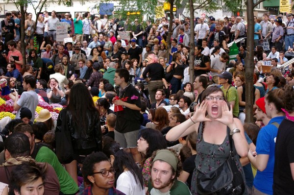
(photo: David Shankbone / Wikipedia. caption: Protesters engaging in the ‘human microphone’ in Zuccotti Park.)
Michael: I love the echo in the photo …On first past, I thought this woman was shouting, protesting. On second pass, I realized she was just getting the word out.
Cara: My eye is drawn to the women shouting in the foreground. Knowing a little bit about how the human microphone works, I searched the image for another person (shouting) and found the woman in the background. The image really invites the viewer to experience what the audio repetition of the human microphone is like.
Phil Perdue (text chat): And again, this image tells a gendered narrative (just like in the poster).
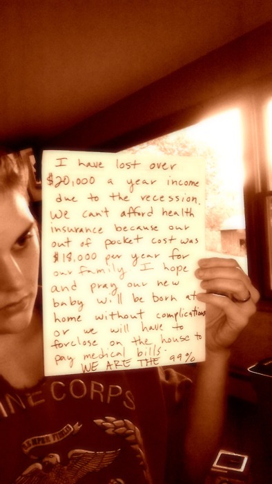
(photo: wearethe99percent.tumblr.com . caption: I have lost over $20,000 a year income due to the recession. we cant afford health insurance because our out of pocket cost was $18,000 per year for our family. i hope and pray our new baby will be born at home without complications or we will have to foreclose on the house to pay medical bills~ WE ARE THE 99%.)
Justin: This entire tumbler for me is tied up with the right wing parody of it, we are the 53%. It is a reference to the 53% of Americans who pay more in federal income tax than they get in deductions and credits and so on. Very shortly after Occupy got started, some right wing bloggers started this tumbler where people would write about how they worked three jobs and their money was going to support welfare and they were pissed off about that basically. It’s interesting that the mode of communication in these images is very ripe for co-option and parody.
James: I think there is a place for vernacular image making. Social media is largely about that. What photojournalists can bring to it is to effectively make associations and organize images in ways that will say something that is more than one thing.
Elizabeth: I see this image as pragmatic and serving more of a logistical purpose. Without these testimonials, the 99% thing is empty rhetoric. It already risks becoming an empty rhetoric without this detail of what exactly it points to and who the people are that are pointing it out. An image like this, it’s interesting to look at it from an aesthetic point of view or a journalistic point of view, but for me it’s purely pragmatic.
Cate Blouke (text chat): I find the marine corps T-shirt especially interesting in this image – since it connects the 99% to the institutional/governmental foundation of the country.
Elizabeth: Because they seem like confessions… they are confessions.” [In answer to the question: “Why are these images so much more effective than if the words were just written on a blog or facebook?
Wray Cummings (text chat): Taking in words through our eyes is different than taking them in through the ear.
msb (text chat): I feel the handwriting does a lot, too. The 53 pecent tumblr features a more people holding printed text than handwriting.
Justin Elliott (text chat): Yeah, I guess the 53%ers still own printers.
Cara: I was struck by how this photos invites a close attention to the improvisational nature of this movement. It plays out in very material ways in this image. I studied a lot of FSA photography and my first thought was that this looked a lot like photos of migrant worker camps made by Lange and others. Is there something problematically improvisational about this image? For someone who doesn’t know much about the movement, does this invite the reading that the occupiers are living like animals or does it says that they are making due, which is what they want to be doing?
Elizabeth: The thing that always won skeptics over upon visiting Zuccotti Park was seeing the capacities that were being built up in the park to provide food, to have a media station, medical care, life coaches, the library… All these quickly established capacities, that spoke to an ability to provide outside the system, really opened peoples minds to the movement.
Spencer: I’m just curious as to why the photographer chose to take the picture with no one in it. Was no one there? Did he ask someone to leave? It looks like water is boiling there… The absence of people gives the photo a very clinical feel. The light is obviously artificial. I don’t think my wire would have accepted it, for better or for worse. … I would have looked for some signage, something to put it in a political context. This is not just a camp in the arctic. This is a camp sustaining a political movement.
Loret: I’m wondering if leaving people out of it makes us look at the objects more closely. (As a result), everyone is beginning to examine the objects ethnographically.
ericamcd (text chat): The whole series by Ben Roberts of the inside of communal spaces are without people. They were in response to the accusations by night thermal imagery that many of the tents in London were actually unoccupied at night. So I think it may be a conceptual response to signs of people without people.
Wray Cummings (text chat): This is real life, the supporting details.
msb (text chat): When I’ve photographed the camps, sometimes I’m surprised by how permanent they can seem. A wooden dresser is not easily transported to the middle of the financial district.

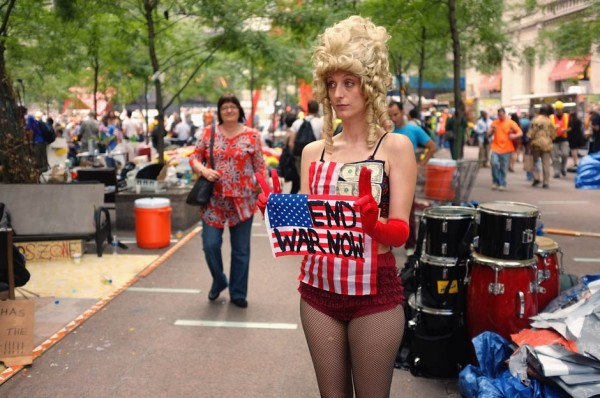
(photo: Spencer Platt / Getty Images. caption: A woman holds an anti-war sign in a park where those affiliated with the “Occupy Wall Street” demonstrations in the Financial District near Wall Street on September 26, 2011 in New York City. Hundreds of activists have been gradually converging on Wall Street over the past two weeks to rally against the influence of corporate money in politics among other issues. Nearly 80 people were arrested over the weekend in a series of incidents with the police as the protesters attempted to march uptown.)
Alison: This image captures how protests can be about spectacle and performance. Looks like she is wearing fishnets and ruffly undergarments. We could talk about the sexualization of protest, maybe not so much with this photograph because it’s so ambiguous with her colonial wig, but it speaks symbolically to larger trends. There are sites like the hot chicks of Occupy Wall Street and the Hot Guys of Occupy Wall Street. There is something noteworthy about the way protest happens and the way it gets embodied very literally in this figure.
Cara: The question we had about the ballerina and the bull is played out here with the woman in this photo. This can be kind of spectacular and silly and fun at the same time.
Alyssa_A (text chat): Did anyone else get Marie Antoinette out of this? That makes her a political figure.
msb (text chat): Money at the breast in a flag -> cash = sustenance for the US.

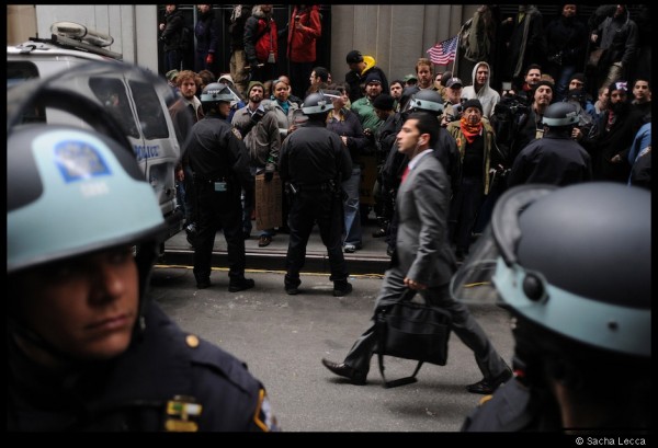
(photo: Sacha Lecca / Rolling Stone. caption: #N17 #OWS “making way for the suits.”)
Spencer: In the month of covering the Occupation, I’ve been trying to make this image, and I never was able to. If Cartier-Bresson was covering Occupy Wall Street, he would have made this image. It just sums it up. It’s clean and covering down there where it is so messy, you are always looking for that image like this, but it never happens.
Justin Elliott (text chat): I was there that morning and this really gets at the visual profiling that the police were engaging in. They had barricades up around the New York Stock Exchange. Initially they were asking for work IDs to get in, but that eventually degenerated into visually profiling people based on whether they looked like a banker a hippie.
Alison: It asks us to think about the police’s role. Who are they there to serve? Who are they there to protect? And the fact that he is walking down the middle of the street. The street is a public thoroughfare.
elspethvanveeren (text chat): I like the (inadvertent) positioning of the flag.
msb (text chat): The cops have rolled out the red carpet. It’s a reverse perp-walk.
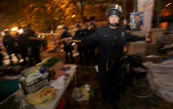
(photo: Jane Tyska / The Oakland Tribune. caption: Oakland police enter Frank Ogawa Plaza as they disperse Occupy Oakland protests on Tuesday, October 25th, 2011 in Oakland, California. Several arrests were made when people failed to leave.)
Loret: We can see so many possibilities in the police man’s expression. We can see a body language of prevention. It’s also interesting the be reminded that the police are vulnerable, too.
Spencer: I am sure the police man is making this gesture for the media. There is likely more than one photographer standing there. It’s been an issue in New York too. When they raided Zuccotti, they were very shrewd, very clever in how they got most of the media out of there.
Michael: I love this picture because it represents the camera as a kind of check and balance as well as a weapon. This guy is caught in a forced portraiture in what was otherwise the very fast destruction of the Oakland camp. His body language feels like he is doing a ‘mea culpa, just doing my job.’ In LA, they slowly leached everyone out of the park and they leached all the cameras out, too. There was much more visual access to what happened in Oakland. You wouldn’t have seen this from LA.
zatopa (text chat): The open visor and artful light do humanize him much more than is usually seen in the riot cop images. It still seems pretty frightening to me, though. I’m somewhat in tune with empathy for the policeman in his shared subjectivity, so to speak, but the baton puts the brakes on that.
Phil Perdue (text chat): Is this cop performing the ballerina’s dance?

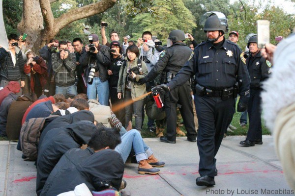
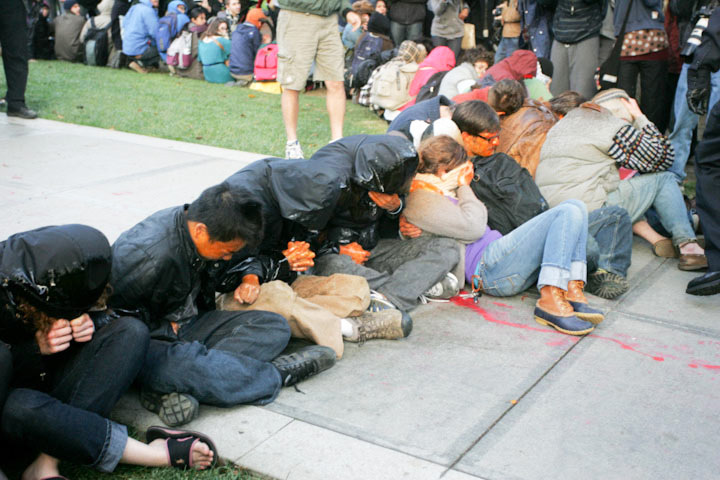
(photo: Louise Macabitas / Reddit. caption: Lieutenant John Pike pepper spraying seated students at the UC Davis protest on November 18th, 2011.)
Loret: This is a complete opposite of the previous images. We don’t see the police officer. His eyes are shielded and he is walking with an uncaring confidence. The people are so submissive and non-violent that the exaggeration between the two perspectives is complete.
Alison: The oppositional clarity in the first image of the bull and the ballerina comes to the fore here. It speaks to that opposition between the aggression and the submissive or passive stance. It also brings up the question of whether media attention to something like this, or the raids and police brutality, reorients us away from the actual issue so we are focusing on another issue, one of violence.
ericamcd (text chat): I think the bucolic background adds to making this look so outrageous. Again, if this were NYC with media everywhere and the urban environs, I think it would read a bit differently.
Marcus Yam (text chat): The red line on the ground is what makes the image interesting. It’s representational of perhaps splashes of blood, even though it’s definitely not blood.
zatopa (text chat): Yes! The woman who is stunned silent is so powerful.
zatopa (text chat): Has the Pepper Spray Cop Meme drained the public power of this image?
Janis_Edwards (text chat): The critical aspect of this image is the nonverbal attitude of the officer, and to me that is still readable here in spite of appropriations, So blase.
Phil Perdue (text chat): There is also the question of how much Lt. Pike was, in a way, compelled to behave this way by the jeering of the crowd, kind of as a way to avoid feeling personally humiliated or weak.

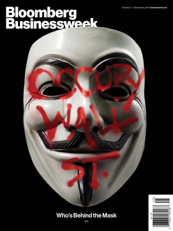
(photo: Jamie Chung. caption: Cover of the October 31- November 6 issue of Business Week.)
Spencer: I like the image. It definitely gives the movement a very sinister narrative that may not be true, but if you’re a capitalist or a businessman reading Bloomberg Businessweek, it makes Occupy an enemy that you should be scared of.
Loret: This image uses advertising language. The presence of the mask and the presence of AdBuster’s beautiful graphics are very confusing because they feel like someone has to be behind this. Occupy presents a question. If anarchism is a real horizontal organization with people communicating and cooperating in new ways, why we are still getting images like this? I’m not condemning Bloomberg for asking the question. I am asking how the initial images like the Guy Fawkes mask have confused the public.
msb (text chat): This image feels like a misreading of protest symbolism. Both graffiti and the mask might be used by the protesters, but here they’re presented as being at odds.
Wray Cummings (text chat): This is the flip of the Adbusters poster — visual ad genius that obscures here illuminates in the ballerina/bull.
The Full Edit
Take a closer look at some of the images from our larger photo edit.




Reactions
Comments Powered by Disqus