Notes
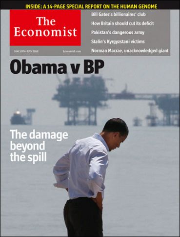
The Economist v Obama

So, how do you clean up a pixel spill?
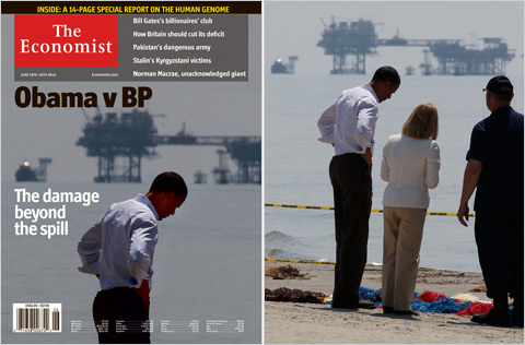
Aric Mayer does a great job breaking down the visual dynamics of the oily Economist Obama front cover hatchet job. I thought I’d say a few words (through my jet lag haze, having just made LA from London) about the visual politics.
If the explanation the Economist Deputy Editor offered the NYT is disingenuous, it does serve to telegraph their motive. Emma Duncan said the magazine wasn’t trying to make a political point, but that’s exactly what they were doing.

You can see it clearly both in the headline as well as the anchor text to Obama’s left. The headline, “Obama vs BP,” completely personalizes the unethically doctored photo. And then, “The damage beyond the spill”, working in concert with the photo-illustration, simultaneously alludes to Obama’s supposedly slumping political fortunes (the rig hanging ominously over his head) while deploying the body language out-of-context to suggest a slumping state-of-mind.
It’s not just presumptuous, however, it’s also dated given that Obama actually gained some political traction coming off that last trip to the Gulf. But hey, if you’re a big time news magazine, you’re watching Newsweek go down, and you think you can safely take a swipe at Obama in your US edition under the cover of transatlantic tensions, what’s a little photoshop jujitsu in the name of tossing the President into a lonely, depressed and watery downward spiraling goo?


Reactions
Comments Powered by Disqus