April 12, 2009
Notes
Notes
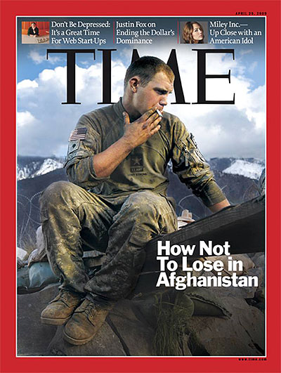
Your Turn: The Afghan Drag

I find this a very strange cover — in the way the soldier is sitting, the way he’s smoking, the way his attention is directed, by where he’s situated. (Also can’t tell what’s to the right of his feet?) And then, the title speaks volumes — not just alone, but in terms of how it informs the photo.
I’m interested in your take. First-timers/long-time lurkers especially welcome.
(image: Adam Ferguson for TIME)


Reactions