Notes
Barack Obama: TIME’s Machiavellian Leftist Of The Year (Or, Shepard Fairey Takes TIME To The Bank)

The moral, I think, is that some things are better left alone. Such as Shepard Fairey’s original Obama poster.
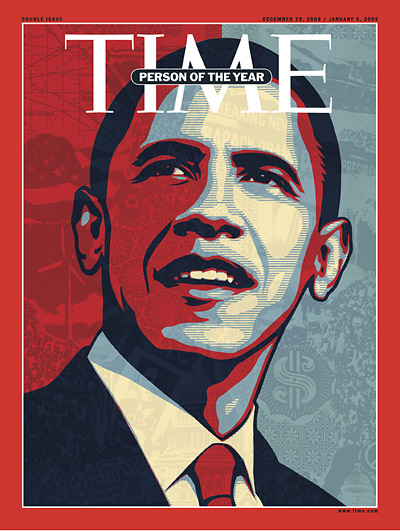
Unfortunately, Fairey’s make-over for TIME seems to play on the Machiavellian idea that a clever, charismatic and left-wing Obama (when was the last time TIME fronted a peace sign?) exploited a couple key issues, turned himself into a pop icon, and scored the presidency out of it.
Reading the pop art cover re-do left-to-right, I see an upward-looking guy who mostly took opposition to the Iraq War (occupying about the top quarter of the illustration) and more talk about alternative energy, wrapped those issues in a patriotic package, and then leveraged the early support of the peace movement (lower right) to curry favor — in light of the public’s profoundly low regard for Washington — to score enormous cash from the teeming hordes (see crowds right of the dollar sign … and lower left, too).
What this shallow illustration seems to bypass, however, is how Obama really won the presidency, which — beyond all the packaging, and the cultish fans, and the war issue — was his demonstration of judgment (on issues as diverse as talking to foreign leaders; being more assertive regarding Pakistan; and not finessing the scale of the economic meltdown) as well as his calm and steadiness under fire.
Besides TIME’s own Obama-envy and the blatant play to a younger demographic, the illustration, as much as anything, seems to telegraph Fairey’s own desire to cash in on the original artwork — another reason for the poster-within-the-poster on Obama’s collar just under his chin, not to mention the enormous dollar sign.
(Fine-tuned 12/18)
(illustration: Shepard Fairey. Cover, TIME’s Person of the Year issue. Dec. 29, 2008)


Reactions
Comments Powered by Disqus