Notes
On that Flint – Detroit Water Comparison Photo
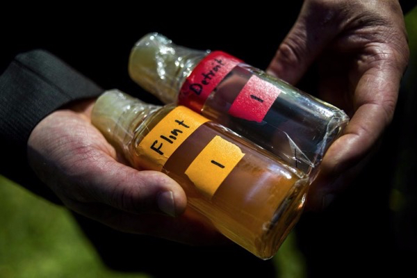
So, I’ve been looking at this Flint crisis photo for a week now and it’s still not sitting well. If you haven’t seen it (its been all over), here’s the caption:
Virginia Tech professor Marc Edwards shows the difference in water between Detroit and Flint. Flint has faced a water contamination crisis since it switched water sources but did not treat the water to prevent lead, a potent neurotoxin, from leaching out of pipes.
So, what’s bugging me?
Largely, that the appearance of the Detroit water isn’t all that clear. Between the “Detroit” label and the number, it seems legible enough, though the finger on the other side of the glass does obscure things a bit. The real problem, though, is the opacity of the middle and lower part of the bottle. If you weren’t aware of the context, it makes the comparison, especially reading left-to-right, like rusty orangy-brown vs. purply-black.
And yes, given Detroit’s notoriety, combining its recent life as a recession poster with all the stereotypes about urban poverty and gang violence, I do think there’s some abiguity here. And I further worry about the allusion — inside the right hemisphere — to pigmentation.
The potential was there to present Detroit as a clear and true standard. It would have been plain to see if the bottom half of the bottle hadn’t been shot against a dark background. I still believe most people get the point. At the same time, though, it also has the quality of caramel versus dark chocolate — or, dirty all around.
(photo: Jake May, The Flint Journal, MLive.com)


Reactions
Comments Powered by Disqus