Notes
On the Hillary Announcement and Logo

In 2016, a challenge for Clinton will be adapting to the political moment with a fresh image while remaining true to her settled identity. “Look at Budweiser,” said a former campaign adviser to President Obama, who spoke on the condition of anonymity to talk candidly. “That’s what Hillary Clinton is. She’s not a microbrew. She’s one of the biggest, most powerful brands ever in the country, and recognizing that is important.”
…
People familiar with Clinton’s preparations said Clark and Spence are focused on developing imaginative ways to “let Hillary be Hillary,” as one person said, and help her make emotional connections with voters.
— from “The making of Hillary 5.0: Marketing wizards help re-imagine Clinton brand” (WAPO)
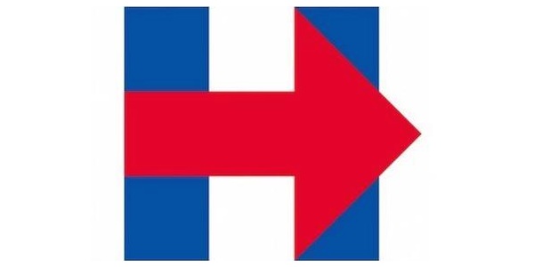
So, there it is. The Hillary ’16 logo. With the abundant comparisons to FedEx, what’s telling right off the bat is that categorically, it’s more corporate than populist or even political — by miles. Beside what register it falls in, it’s also inscrutable. Perhaps one reason, if you read the marketing piece above, is that Hillary ’16 has not just one supreme ad guru, but two. If the logo suggests anything, it’s another campaign designed by committee.
The logo is not just corporate, but it’s also monolithic. If one task of the campaign is to avoid being perceived as elitist or dynastic, I don’t know about the heavy massing and the sense that Team Clinton has designed an American monogram or laid claim to their own letter of the alphabet (unless they went all in on a catchy favicon). I also don’t understand why they went for an identifier that is so abstract and amorphous. I thought accessibility and familiarity was a critical criteria.
Consider the logo for the “Ready for Hillary” Facebook page boasting 2.2 million followers. It’s familiar. It’s personable. It stresses gender both in her name and the electorate’s readiness.
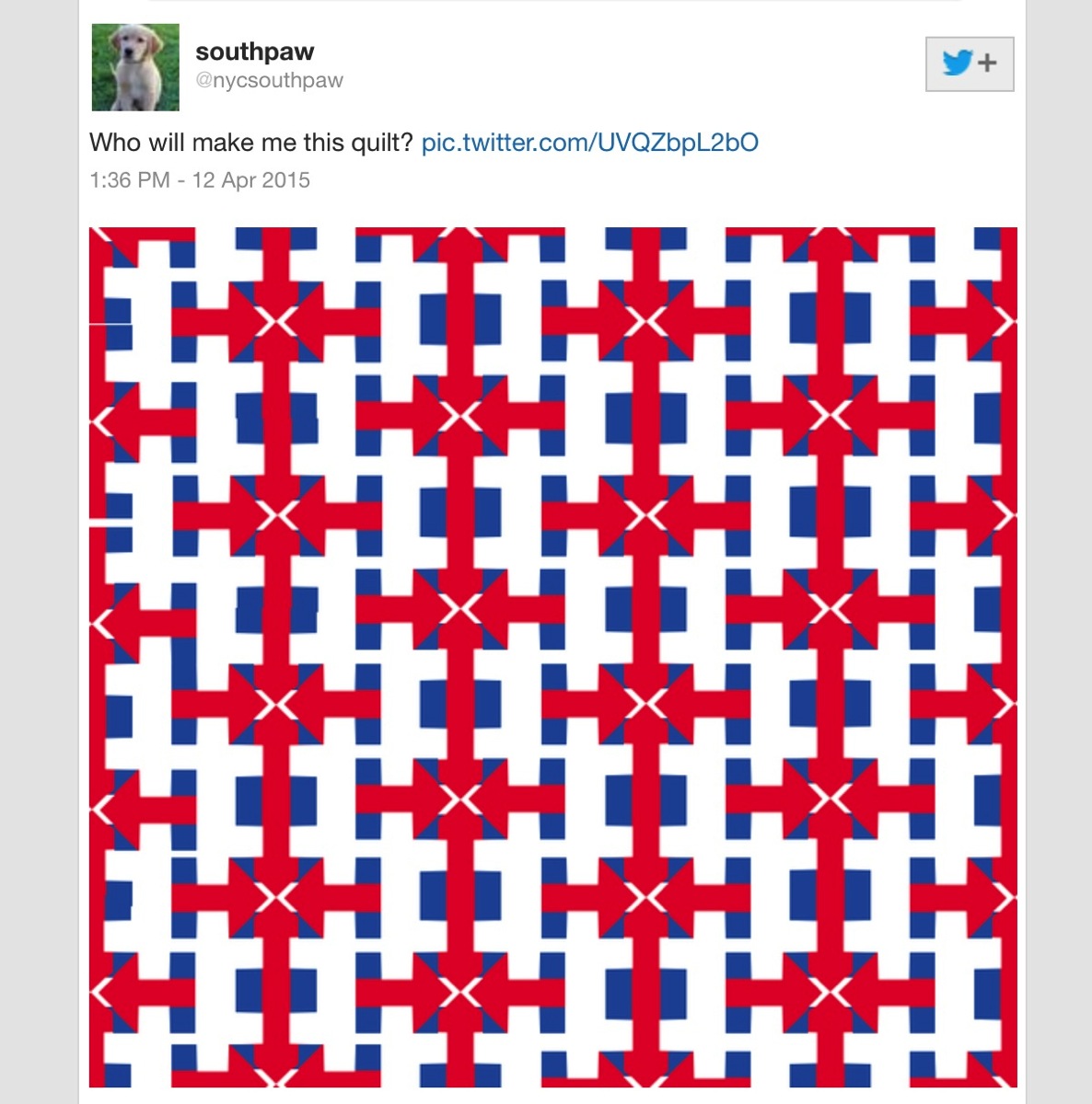
Not surprisingly, the social sphere was swirling with a great deal of Photoshop artistry (and snark) yesterday inspired by the new logo. The tweet that hit it on the head for me, though, was the one at the top of the post — the one with the cute doggy for a profile pic turning the logo into a quilt. Yes, it’s an attempt to create some quality of gender from the logo. Even more so, it’s about locating what everybody but Clinton in the kickoff video was oozing, which was personal craft, and and an unapologetic sense of feeling at home.
— Michael Shaw
(image 1: nycitysouthpaw/Twitter. image 2: HillaryClinton16. image 3: Ready for Hillary/Facebook)


Reactions
Comments Powered by Disqus